DESIGN PROBLEM:
No problem, I just like their brand and wanted to design some packaging for a San Diego based brand, and show that I can assimilate into an existing brand identity while bringing my own creativity to it.
DESIGN SOLUTION:
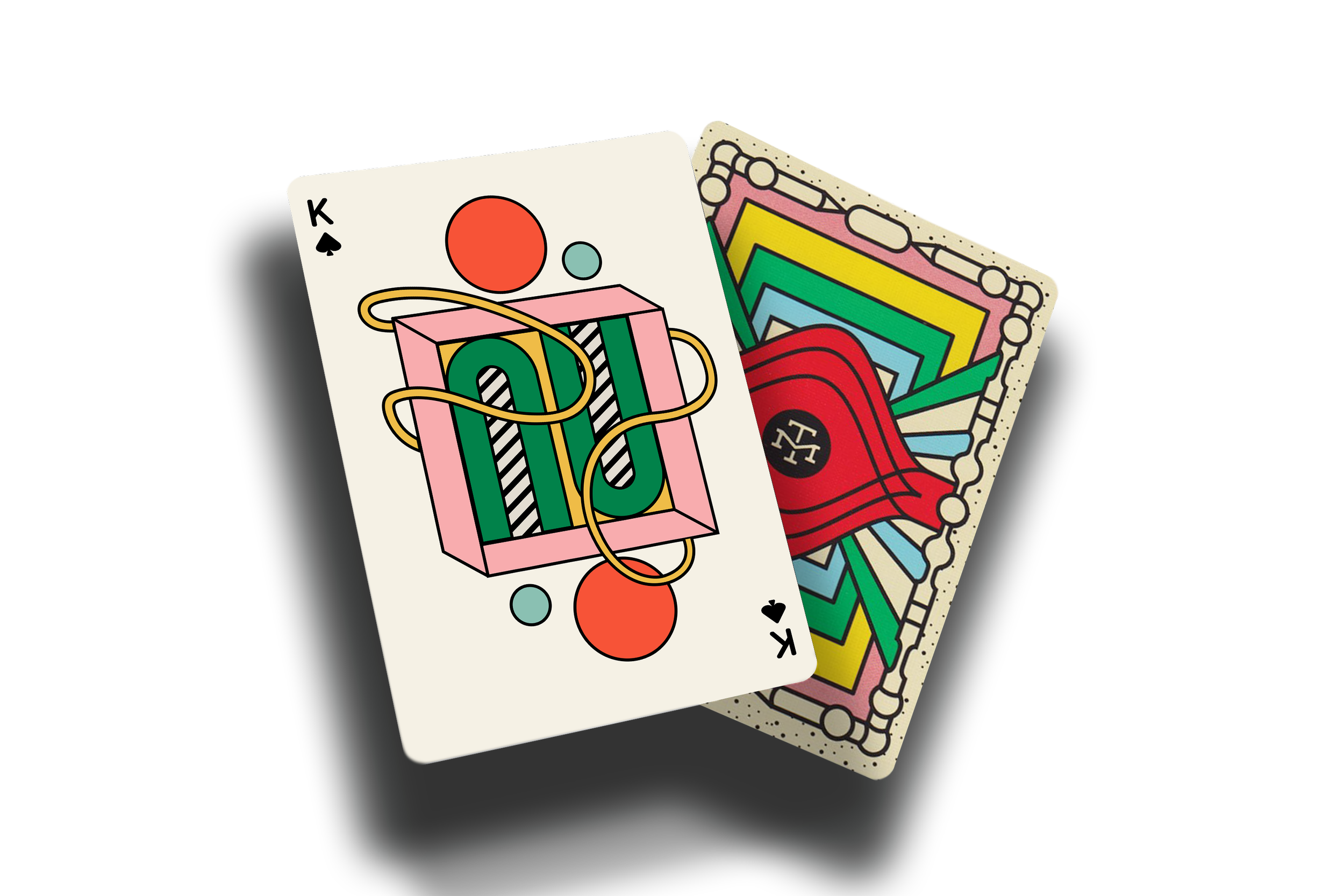
I came across a playing card deck that Modern Times put out, and decided I would make some special edition beer packaging that ties into this deck. It was a fun way for me to take an existing visual vocabulary, and construct a new sentence with it.
XXX-XXXX
P R O J E C T :
BEER CAN LABEL
[ ILLUSTRATIONS ]
PROJECT BRIEF:
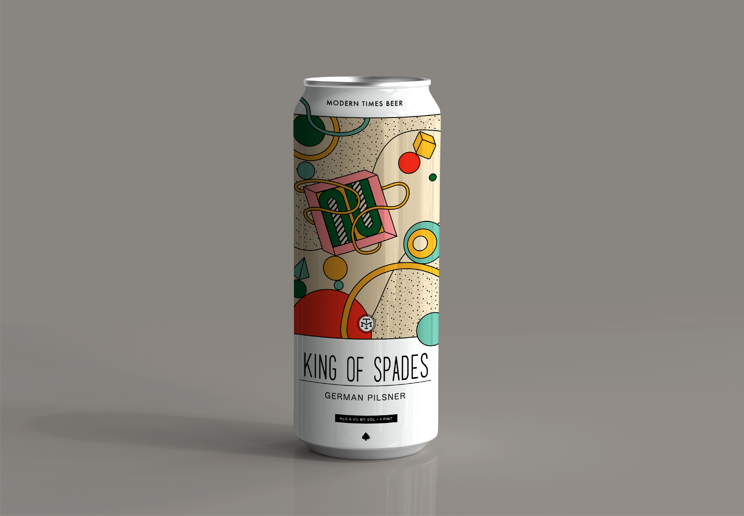
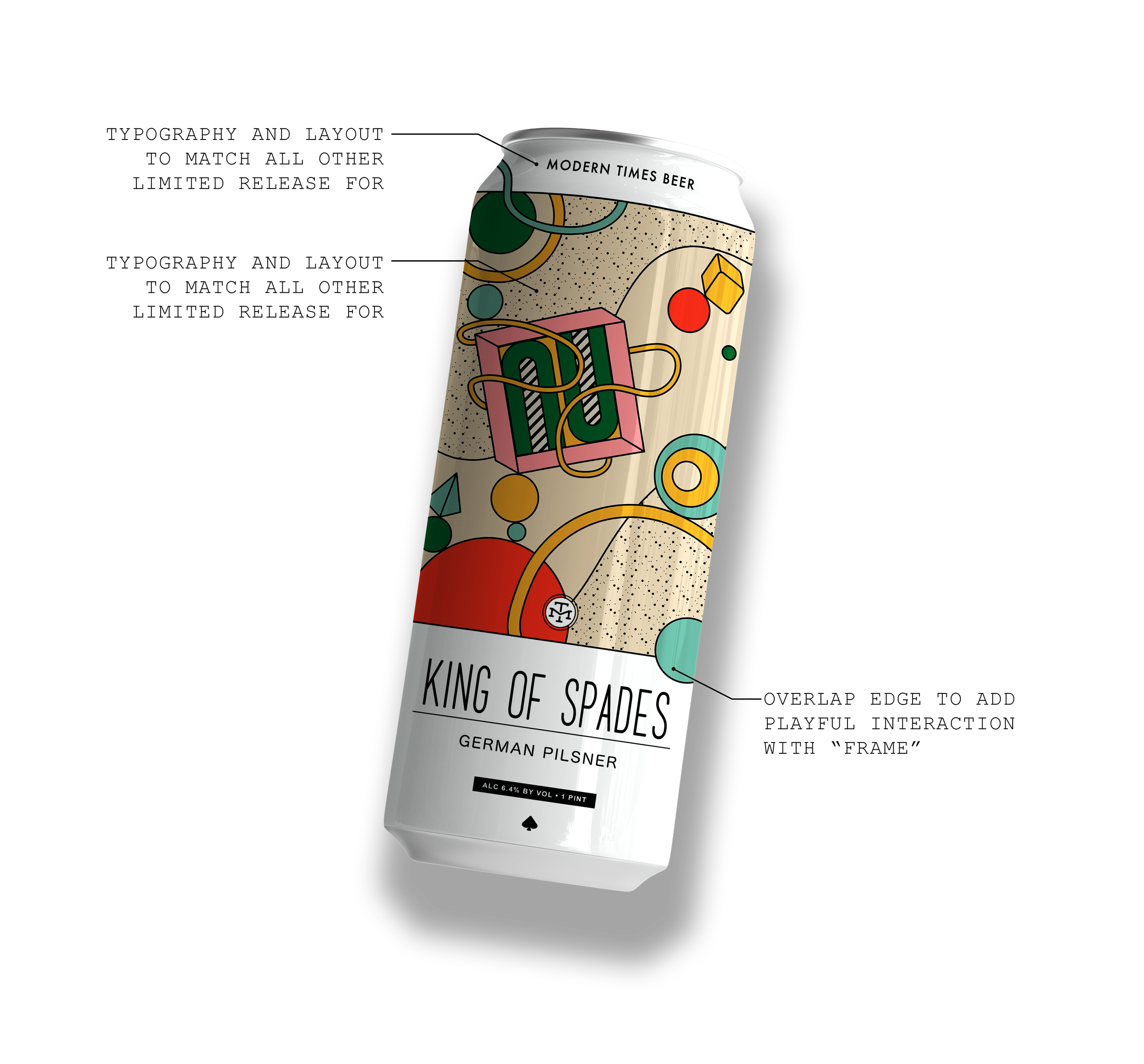
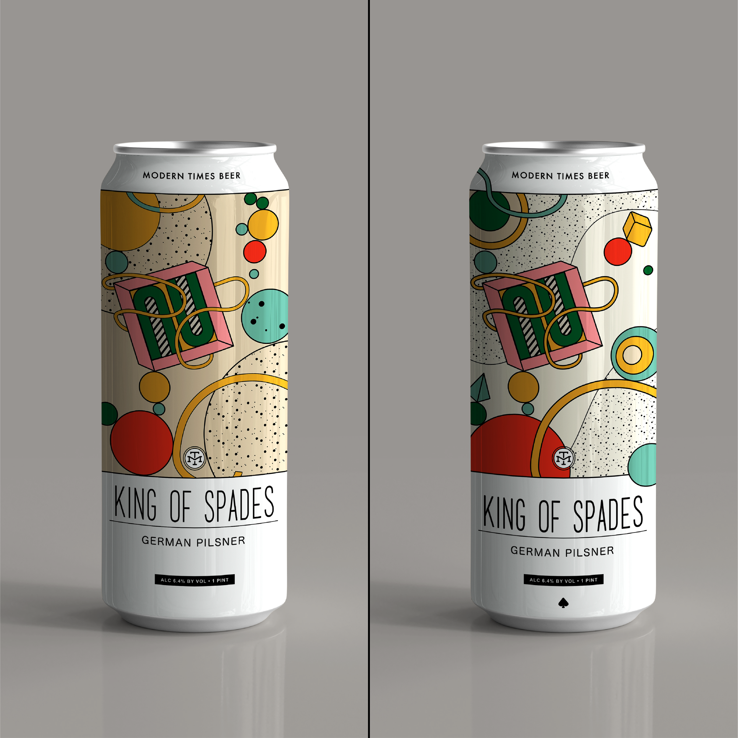
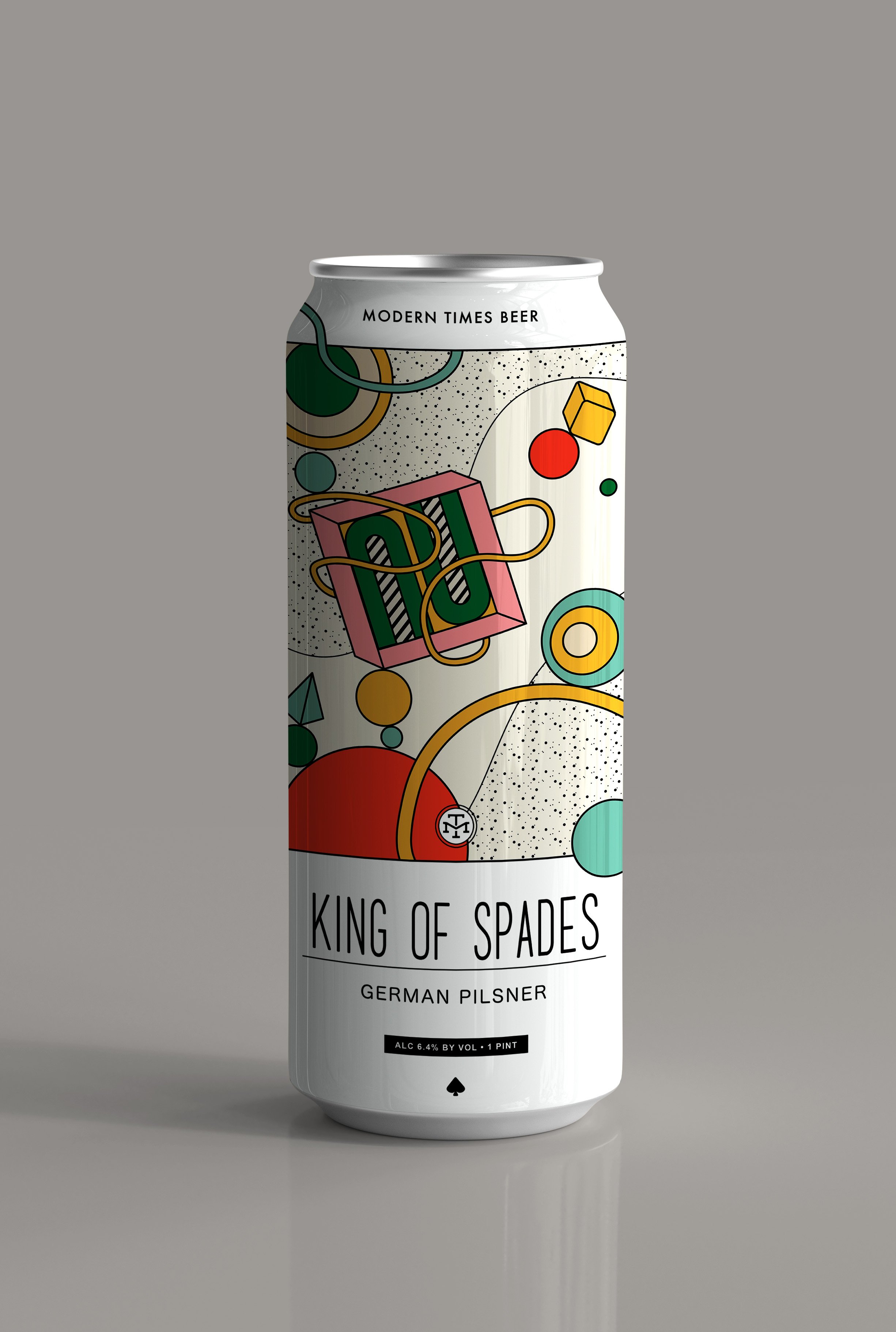
Take the King of Spades card from the Modern Times playing card deck and reimagine it as a beer label. Packaging should match the existing limited release beer branding, and be a clear tie in to card deck to cross promote both products for a “game night” complete set.
TOOLS USED:
ILLUSTRATOR
PHOTOSHOP
IDEATION:

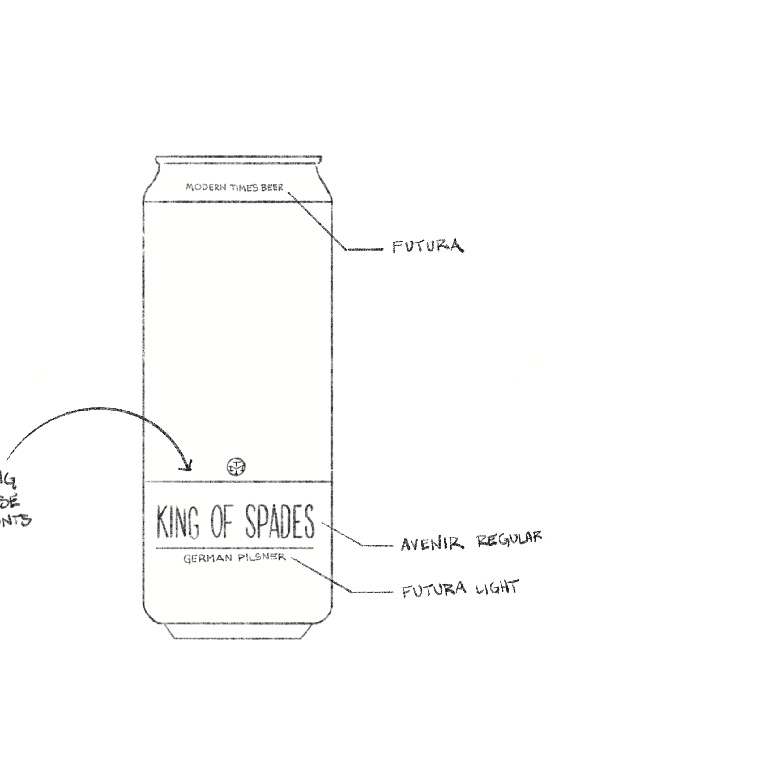
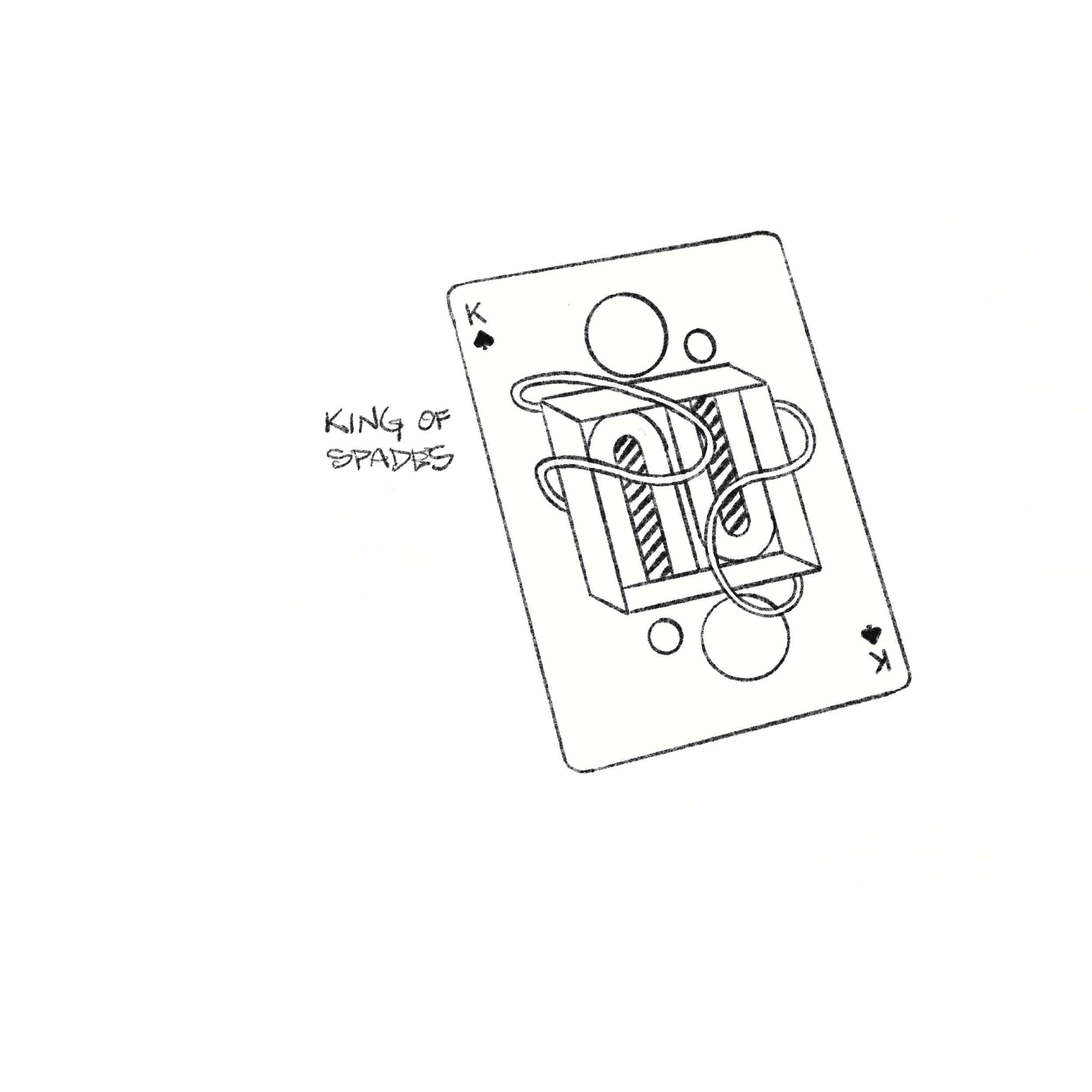
MODERN TIMES
DESIGN ITERATIONS
[ BEER CAN LABEL ]
ITERATIONS:
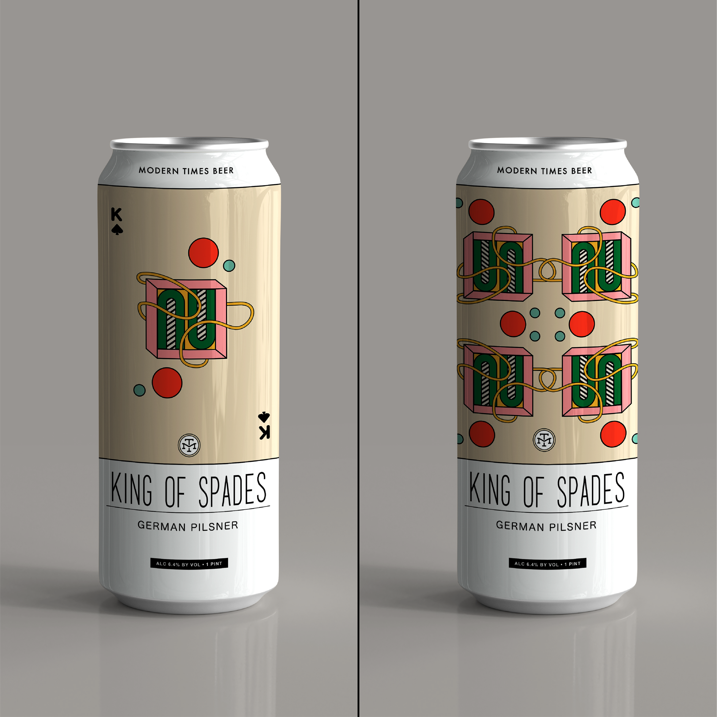
I wanted to use the king of spades design as my starting point and abstract the elements from there. This set my rules for shape and color, which left composition and balance as the two isolated elements for me to play with. I like to work through a few iterations of a design concept so I can evaluate what is working and what isn’t and apply those lessons learned to the more fully considered final design.
BAND OF SHADOWS
FINAL IMAGES
[ MARKETING MATERIAL ]
NEXT STEPS:
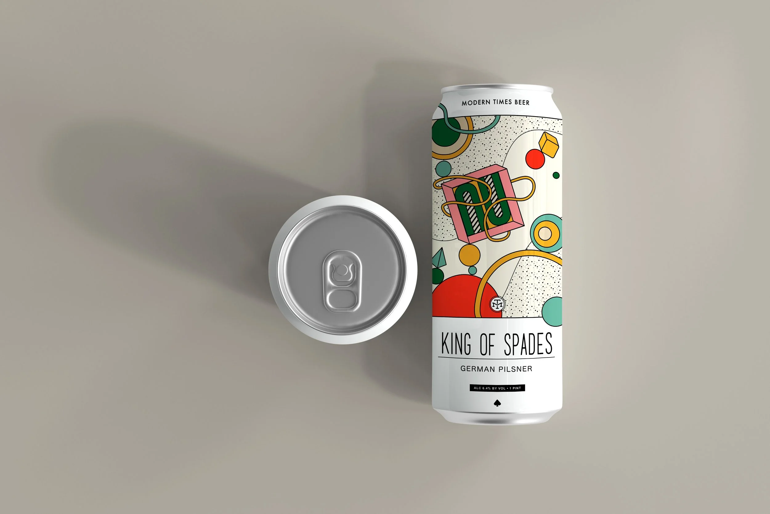
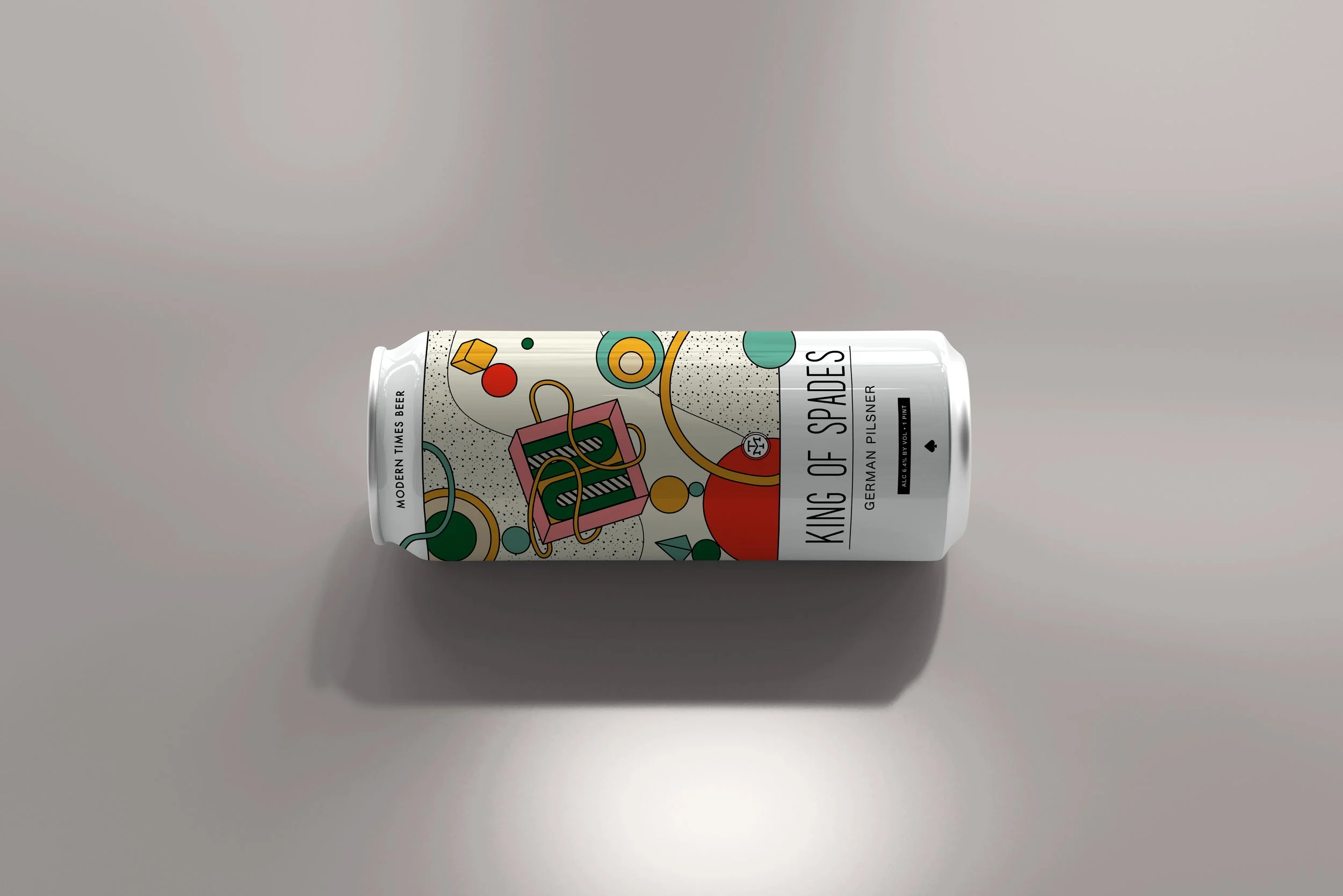
To communicate a concept, digital mockups would be sufficient. From here I’d likely print physical mockups to confirm how it feels at actual scale, from balance to legibility. I’d make sure print ready files had annotations for material and color selections, then begin the sampling process for actual production.
EXPLORE OTHER PROJECTS

