DESIGN PROBLEM:
I am a designer with experience in multiple disciplines of design and a fine artist as well. This creates a diverse set of work for me to display. I don’t want to have completely separate art + design identities but want to preserve my art practice as its own entity. I need a way to show all of my work, promote my services, sell my goods, and hopefully expand my networking capabilities.
DESIGN SOLUTION:
I created a design studio that acts as an umbrella to promote my own creative work, but also that of an entire network of creatives I’m affiliated with. This way my artist identity is just one member of a connected network of creativity. I’ve developed a brand guide for this studio including logo mark and icon, typography selections, color palette, website development, custom printed merch and more. This studio promotes creative community and experimentation so I am always learning and growing as an artist and designer.
XXX-XXXX
P R O J E C T :
BRAND DEVELOPMENT
[ ILLUSTRATIONS ]
PROJECT BRIEF:
Take the King of Spades card from the Modern Times playing card deck and reimagine it as a beer label. Packaging should match the existing limited release beer branding, and be a clear tie in to card deck to cross promote both products for a “game night” complete set.
TOOLS USED:
ILLUSTRATOR
BLENDER
GOOGLE SUITE
INDESIGN
PHOTOSHOP
SQUARESPACE
IDEATION:
LOST LIGHT LABS
BRAND GUIDE
[ BRAND DEVELOPMENT ]
PRIMARY COLOR PALETTE
LOGO
TYPEFACE SELECTIONS
SECONDARY COLOR PALETTE
BRAND GUIDE:
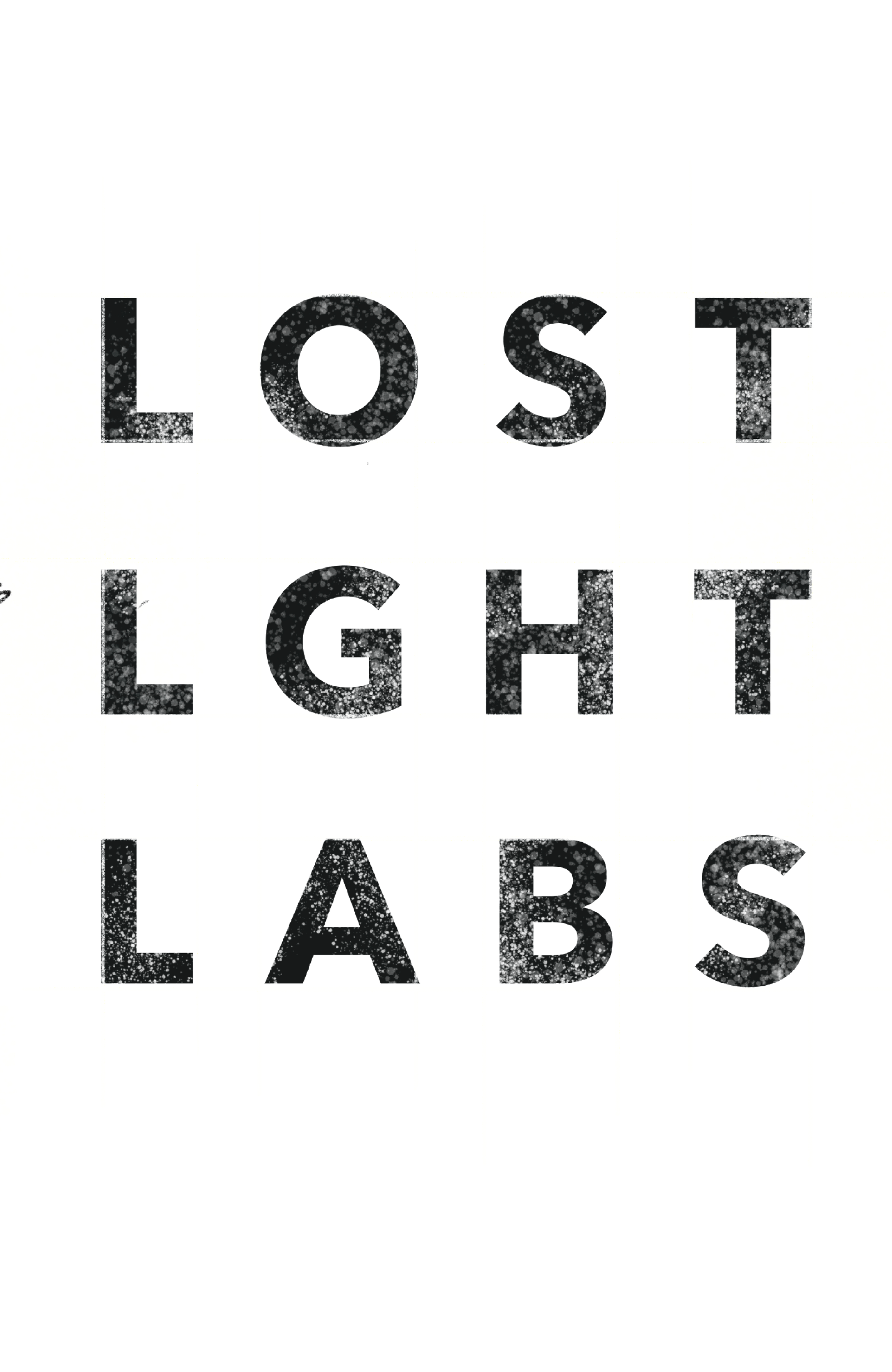
This studio is all about showcasing work from myself as well as from a network of other creatives. To elegantly handle mixing these various aesthetics, the overall branding for the studio should be rather pared back and utilitarian. That is why I have gone with typeface selections that may seem rather sterile, but it is precisely this neutrality that makes them ideal for this brand identity.
BRAND COLORS:
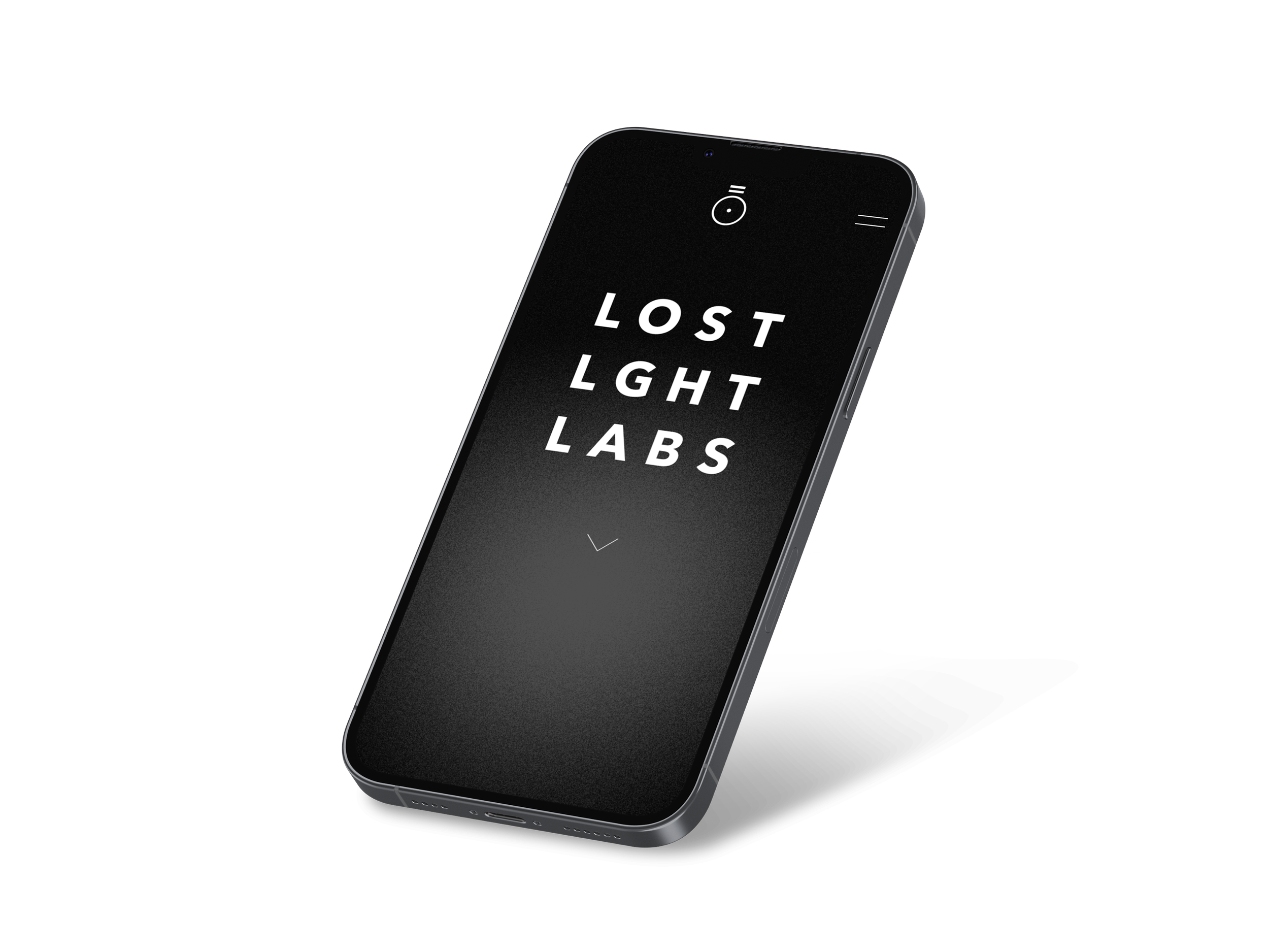
Similarly the color palettes being introduced are unpredictable and varied so primary brand colors are stripped back to punchy uses of black and white so that the project or product may dictate the color story for each instance. Color selection also is doing some of the storytelling of the brand. The dark and black parts of the site represent being lost searching for light, and the colorful parts of the site represent the creative output, the “found light”. The site simulates light passing through a prism.
LOST LIGHT LABS
ART DIRECTION
[ BRAND DEVELOPMENT ]
VISUAL THEMES:
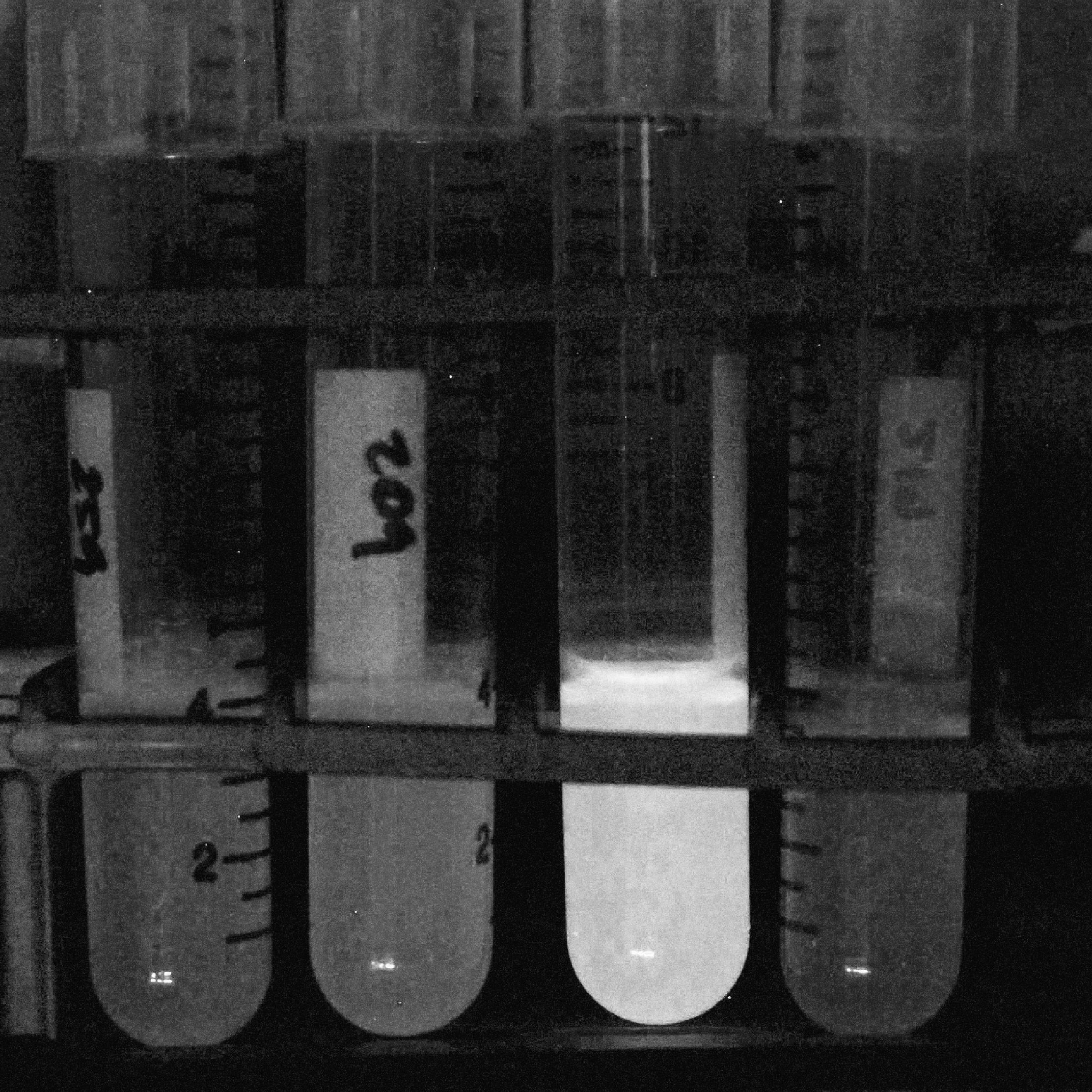
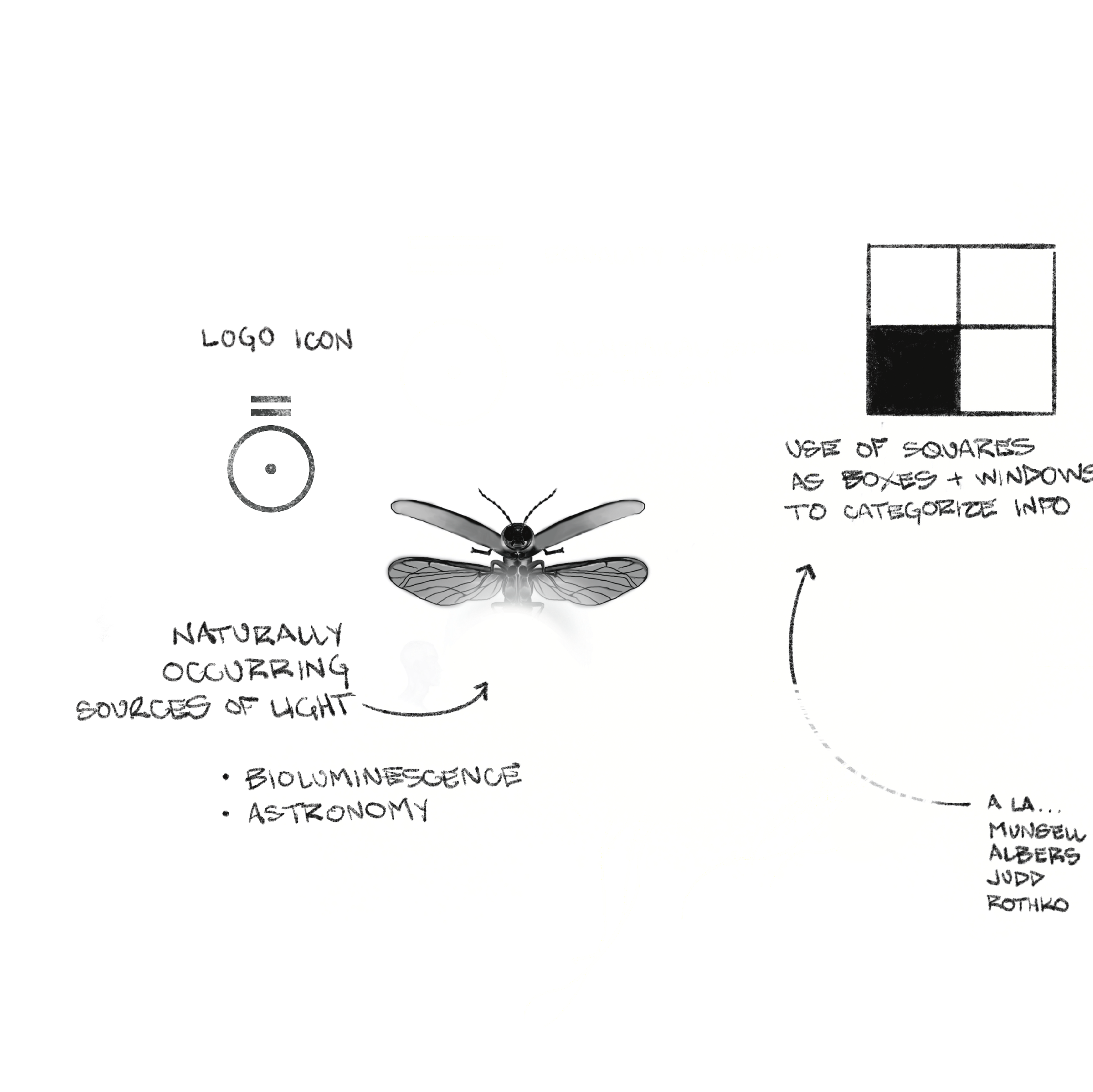
Naturally occuring light sources (astronomy, bioluminescence)
vintage tech (film photography, tv static, vinyl)
scientific illustration (leader lines + annotations)
cartography (maps, star maps, topographical lines)
LOST LIGHT LABS
UNIVERSE
[ BRAND DEVELOPMENT ]
EXPANSIVE NETWORK OF CREATIVES:
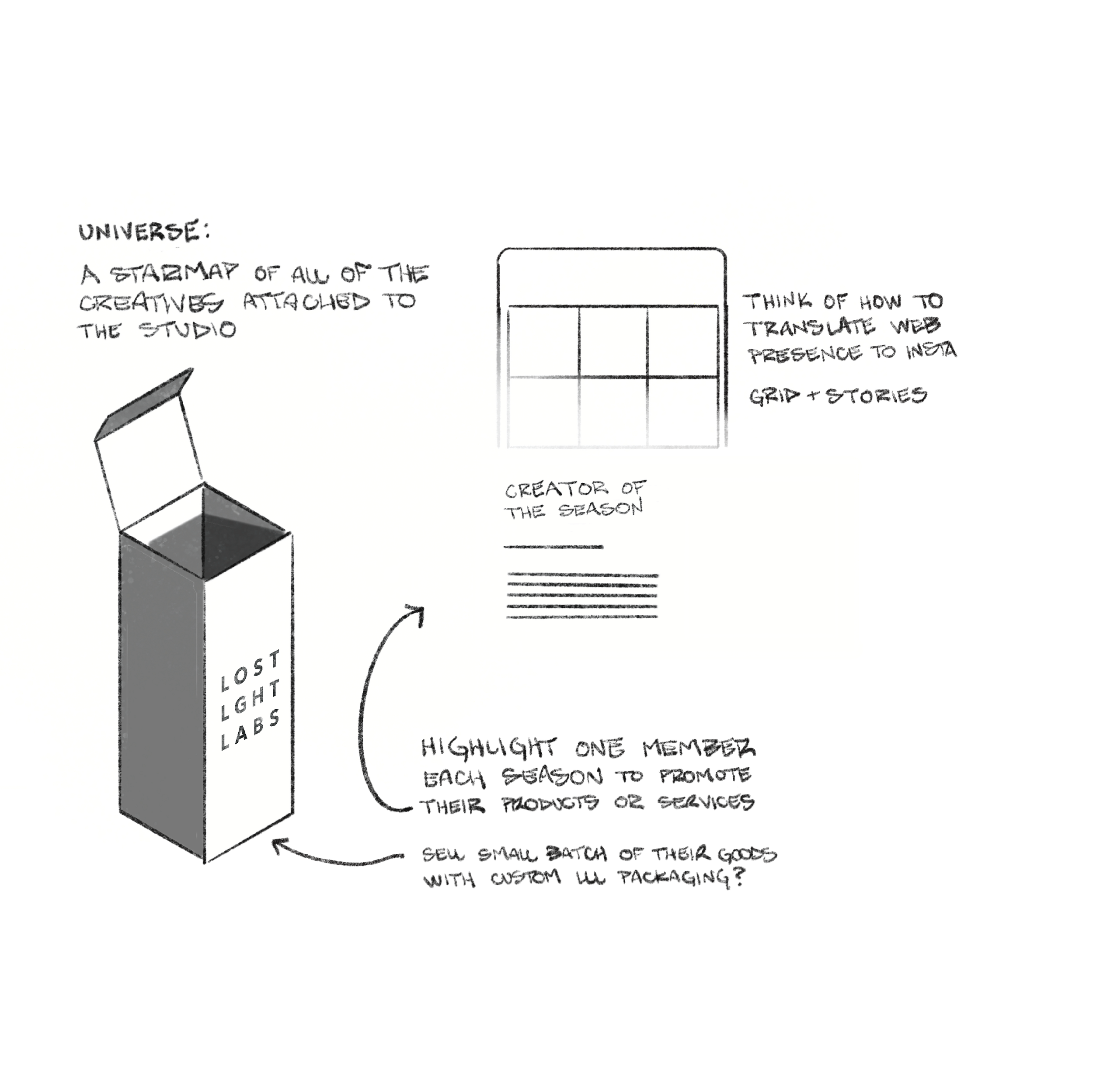
The Lost Light Universe is an ever expanding database of the creatives that are connected to the studio. When my inspiration is lacking, there is an entire network of talented creative people in my life that I can promote, be inspired by, and collaborate with. I wanted something that would encourage me to build creative community, and help make it easier to shop local, shop small, and support fellow creatives in their grind to keep their lights shining.
CREATOR OF THE SEASON
LOST LIGHT LABS
CUSTOM MERCH
[ BRAND DEVELOPMENT ]
Custom merchandise is a fun exploration that generates income for the studio but also allows me to experiment with various printed goods so that I can use those avenues to help brand building at work and with freelance clients.
EXPLORE OTHER PROJECTS
